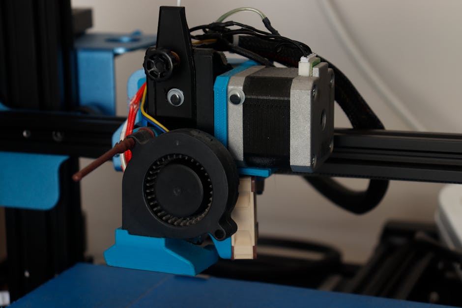

Getting razor-sharp 3D printed text isn’t about magic—it’s about choosing a filament that stays dimensionally stable and setting it up so it lays down clean lines. Below, you’ll learn which materials usually perform best for tiny details, and the slicer adjustments that help letter edges look crisp instead of rounded.
Choose the filament that behaves well on tiny text
PLA and PLA+
PLA is usually the safest bet for sharp text because it tends to print predictably with relatively low heat and strong layer definition. In practice, that means less ooze and more consistent line edges, which helps strokes stay thin and corners stay pointy.
PLA+ is often chosen when you want a little more toughness or slightly better behavior across temperatures than basic PLA, while still benefiting from PLA-style precision. For text that will be handled (labels, desk signs, small parts that get tapped), PLA+ is commonly the sweet spot.
If you want specific examples from common PLA-style options, you can start with OVERTURE PLA Professional 1kg 2.85mm Yellow or SUNLU PLA+ 1kg 1.75mm Wood. For very readable lettering where you care about how clean the surface looks, SUNLU PLA+ 1kg 1.75mm Grass Green is also a solid choice, since you’re still in the PLA+ category where crisp edges are the expectation.
You may also see very fine-text-friendly results with a lower-cost or specialized PLA formulation such as 3DLabPrint PolyLight 1.0 LW-PLA 1kg 1.75mm Orange. The important part isn’t the color—it’s that it’s PLA-based, so it generally offers the same precision-friendly behavior you’re targeting for letters.
PETG
PETG can be excellent when you need durability, but it’s not always the easiest material for razor-sharp text. PETG is more likely to string and can produce a more “wet” look when the temperature is slightly high or cooling is off. That doesn’t mean you should avoid it—just expect more dialing-in to keep letter edges crisp.
Use PETG when the part needs more impact resistance or slightly better real-world resilience. For example, OVERTURE PETG 1kg 1.75mm Starry Blue and OVERTURE PETG 1kg 1.75mm Sparkle Blue can both work well, especially for functional signage, cable labels, or outdoor-ish applications. The tradeoff is that you’ll typically spend more time on temperature, retraction, and fan control to prevent blobs and thin strings from “filling in” tiny gaps.
Dial in layer height and nozzle settings for crisp lettering

Start by matching the layer height to your nozzle and detail goals. As a practical baseline:
- For small text, aim for a thinner layer height (often around the 0.1–0.2 mm range on a typical setup) so each line is built with less vertical wobble.
- If you’re using a standard nozzle (commonly 0.4 mm), thin layers help a lot because your horizontal line width still defines the stroke thickness. Even with perfect settings, the nozzle diameter effectively limits how small a feature can be.
Nozzle choice matters too. If your printer supports it, a smaller nozzle (like 0.25 mm class) can improve the sharpness of letter strokes because the toolpath can follow detail more closely. If you’re stuck with a 0.4 mm nozzle, you can still get sharp text, but you’ll need to keep the text size and stroke width realistic for that line width.
Also pay attention to minimum feature sizes in your slicer. Tiny letters can look “rounded” simply because there isn’t enough toolpath to represent a sharp corner at your chosen layer height and extrusion width.
Set temperature, speed, and cooling to prevent blobs
Blobs and rounded letter edges usually come from a combination of over-temperature, over-extrusion, too-fast printing, and insufficient time for the previous layer to settle.
Temperature range: keep it toward the cooler side
For PLA, most setups run somewhere in the “low 200s down to the high 100s” depending on the filament and printer, but the guiding rule is the same: if you see blobbing on re-traces or tiny zits at the start/end of moves, drop temperature in small steps.
For PETG, the target range is typically higher than PLA, and the same strategy applies: when details blob or strings look sticky, reduce temperature slightly and re-test.
If you’re unsure where to start, rely on the filament’s recommended range as a starting point, then tune down for crisp text. You’re not trying to make the plastic “cold”—you’re trying to stop it from flowing too freely.
Speed: slow down where letters matter
Text is sensitive to acceleration and sudden directional changes. If the printer zips through letter corners, the nozzle can deposit extra plastic before the model path changes.
Reduce speed for perimeters and especially for small details. A slower print doesn’t just improve surface quality; it also helps the slicer’s tiny movements translate into consistent extrusion, reducing those little over-pressurized blobs.
Cooling fan: PLA needs it, PETG needs careful moderation
Cooling is one of the biggest levers for sharp text:
- With PLA, part cooling is typically beneficial. Adequate airflow helps each layer solidify quickly so thin strokes don’t sag or fuse into adjacent gaps.
- With PETG, too much cooling can sometimes increase layer adhesion issues or cause other surface artifacts depending on your exact setup. In general, keep cooling controlled: enough to keep details crisp, but not so aggressive that you get poor bonding or surface roughness.
If your text looks slightly “melted,” increase cooling (especially for PLA). If your PETG looks brittle, weak between layers, or shows poor fusion, ease back.
Calibrate retraction and flow so corners stay sharp
Even with perfect temperatures and cooling, you can still get rounded corners and blobs if the printer doesn’t stop extrusion cleanly.
Retraction: fewer strings, cleaner stops
Stringing can smear tiny gaps between letters, and that “filling” makes text look less sharp. Clean retractions help the nozzle stop depositing filament at the right moment.
Use your printer’s baseline retraction settings as a starting point, then adjust carefully:
- If you still see strings or wisps between letters, increase retraction slightly or reduce temperature a bit.
- If you see clicking, grinding, or under-extrusion artifacts right after travel moves, reduce retraction and/or slightly increase temperature.
What matters for text is consistency. Over-correcting retraction can create its own artifacts (zits or gaps), and those artifacts show up fast at small sizes.
Flow and extrusion width: tiny over-extrusion ruins fine detail
When letters look swollen or “fat,” it’s often flow. Even a small over-extrusion can turn sharp strokes into rounded ones.
Before chasing slicer settings for hours, do one controlled calibration:
- Print a small, flat detail test (or a thin-walled shape) and check whether lines look exactly the way your slicer expects.
- If strokes are too thick or corners bulge, slightly reduce flow/extrusion multiplier.
For text specifically, under-extruding slightly can be preferable to over-extruding, because missing filament is often less visually damaging than extra filament that fuses together.
Z-offset and first-layer consistency
Text prints rely on stable height across the print. If your first layer is too high, the nozzle can struggle to lay down consistent filament, and tiny text may look uneven. If it’s too low, you can flatten lines and reduce sharpness.
Once your first layer is dialed in, avoid changing nozzle height mid-project. Even small z-offset changes can affect the crispness of thin strokes.
Run a quick test print and refine
The fastest way to get consistently sharp text is to validate your settings with a small, targeted test, then iterate in small steps.
Use a test that includes:
- Different letter sizes (so you learn your practical minimum thickness)
- Thin strokes and tight curves (to reveal blobs and corner rounding)
- A few different orientations (so you can spot directional issues)
When you compare results, change only one thing at a time:
- If corners are rounded: lower temperature slightly or reduce flow.
- If there are blobs at travel starts/stops: focus on retraction and travel/stop behavior, and reduce temperature.
- If letters look stringy: increase retraction slightly and reduce temperature, then adjust cooling for the filament type.
For best reliability, dry filament (especially if your PETG or PLA has been sitting around). Moisture can create tiny bubbles and unstable flow, which become blobby artifacts in fine lettering.
If you want a practical starting point by material: choose a PLA-based filament for maximum ease when the goal is crisp readability (for example OVERTURE PLA Professional 1kg 2.85mm Yellow or SUNLU PLA+ 1kg 1.75mm Wood). Switch to PETG (such as OVERTURE PETG 1kg 1.75mm Starry Blue) only when you need the durability tradeoff—then expect a little more tuning for retraction, temperature, and fan.
Pick the right filament for your goal
Choose PLA or PLA+ when text clarity is the priority: crisp edges, readable small lettering, and lower effort to get clean surfaces. For functional labels that still need fine detail, PLA+ is a strong choice.
Choose PETG when the part will see more wear or real-world handling, and you’re willing to tune your setup to control strings and blobs.
One good way to decide quickly is to match the filament to the environment:
- Indoor decorative and signage text: PLA-style filaments like SUNLU PLA+ 1kg 1.75mm Grass Green.
- Functional but detailed parts: PLA+ options like SUNLU PLA+ 1kg 1.75mm Wood.
- Durability-first text labels: PETG options like OVERTURE PETG 1kg 1.75mm Sparkle Blue.
For the sharpest results overall, keep layer heights thin for detail, run temperatures toward the cooler side of the filament’s range, and use cooling that matches the material—then confirm with a small lettering test before printing the full text piece.
PriceIt3D may earn a commission when you buy through links on this page, at no extra cost to you. Affiliate notice.